Newsletter or Poster? Choosing a Format for the Message
Choose a newsletter or poster by matching the message’s need for explanation to where readers will meet it, so the format supports real attention.
The common mistake in choosing a newsletter or poster is to start with the format someone likes making. That can leave a poster crowded with paragraphs or a newsletter carrying a message people needed to notice at a glance. The cost is not just extra design work: readers may miss the point because the format asks for the wrong kind of attention.
Start instead with two questions: how much explanation does the idea need, and where will people encounter it? A poster is usually strongest when a reader can grasp the central message in passing. A newsletter has more room for context, sequence and links, and it can reach someone in a place where reading is already expected. Neither format is inherently more persuasive. Each suits a different encounter.
Newsletter or poster choice
A newsletter is a message delivered in an email or printed bulletin, generally arranged as a short reading experience. It can include a lead, supporting paragraphs, images, links and a clear next action. A poster is a displayed page designed to communicate in a shared physical or digital space. Its words and visual order must work for a person who may be walking by, looking from a distance or dividing attention with something else.
The simplest distinction is depth versus encounter. Newsletters give an idea room to unfold. Posters put an idea where an audience is likely to see it. That is not the same as saying newsletters are always long or posters always contain little text. It means the format should fit the conditions under which a reader will pay attention.
Think of a newsletter as a letter on a desk and a poster as a sign on a door. The letter can explain why a change is happening; the sign can point out where to go. Either can be beautifully made, but swapping their jobs makes the reader work harder.
Explanation needs
List the questions a reader must have answered before they can understand the message. If the idea depends on reasons, qualifications, a sequence of events or answers to likely objections, a newsletter has useful space for those parts. It can lead with the main point, then offer context and detail in an order that makes sense.
A poster suits a message whose meaning survives compression. An event notice may need a name, a time, a place and a way to find further details. A reminder may need only a clear action and a reason to act now. If the subject needs a careful explanation, putting every detail on the poster rarely solves the problem. It can obscure the part a passer-by most needs to notice.
Try writing the message as a single plain sentence, then ask what a reader would misunderstand without more information. If the missing context changes what the sentence means, a fuller format may be necessary. If details merely help someone follow up, a poster can carry the central point and direct readers to a newsletter or another source.
This is not a word-count exercise. A short message can still be conceptually difficult, while a longer announcement may be easy to understand. The useful measure is how much information must be taken in before the reader can interpret the point correctly.
Places and attention
Where the message appears changes what it can reasonably ask of its audience. Someone opening an email may have chosen to read updates, though the newsletter still competes with other messages. Someone passing a noticeboard may give a poster only a brief look. A poster on a website can be viewed at closer range, but it still needs a clear hierarchy if readers are scanning rather than settling in to read.
Consider distance, lighting, movement and the reason people are in that place. A poster near a library entrance can announce a talk to visitors who are already nearby. A newsletter sent to interested readers can explain the talk’s subject, who it is for and how to register. These are different encounters, so the same wording and level of detail may not serve both.
Access matters too. If the audience is unlikely to check email, a newsletter may miss them even if it offers the best explanation. If people need to keep a notice or share details with someone else, a printed poster may be useful at the point where that decision is made. Choose for the audience’s actual route to the information, not merely for the channel that is easiest to produce.
Questions readers ask?
Can a poster include a long explanation?
It can, but that does not mean readers will give it the time the text requires. If the explanation is essential, use the poster to state the central point and provide a clear route to the fuller account.
Can a newsletter work as a poster?
Sometimes, if its content can be reduced to a message a person can understand in passing. Retain the central action or idea, then remove detail that depends on reading a sequence of paragraphs.
Should I use both formats?
Use both when the audience meets the message in different places or needs both a quick prompt and a fuller explanation. Make each format useful on its own: the poster should still communicate its main point, while the newsletter can add context rather than merely repeat it.
What if the message is still changing?
A newsletter can be easier to revise and resend when details remain unsettled, while a displayed poster can become misleading if its information changes. If an update is likely, make clear where readers can find the current details and avoid leaving outdated copies in circulation.
A useful division
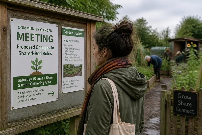
Imagine a community garden is inviting neighbours to a meeting about changing its shared-bed rules. The organisers have a simple noticeboard beside the entrance and an email list for people who already receive garden updates. The proposed rules need explanation: readers will want to know what is changing, why and how to respond. A poster could announce the meeting, identify the subject and point to the email list or a linked explanation. The newsletter could set out the proposal and invite questions before the meeting. The expected result is that a passer-by can recognise the invitation, while an interested reader can understand what is being discussed.
The division works because each format carries a different part of the communication. The poster does not try to host the full debate, and the newsletter does not have to act like a roadside sign. If the meeting details change, the organisers can update the newsletter information and replace the notice, rather than asking either format to do every job.
Choosing the format
Before committing, make a small decision record. It keeps the choice tied to the message and the audience instead of personal preference:
- Essential explanation: Write down what readers must understand. If it needs a sequence or supporting reasons, lean towards a newsletter.
- First encounter: Name where readers will see the message and what they are likely to be doing there. A passing audience favours a poster that communicates quickly.
- Attention available: Decide whether the reader is likely to stop, open an email or return later. Do not assume every person will do so.
- Required action: State what the reader should do next. If the action needs directions or more information, give the poster a clear route to it or explain it in the newsletter.
- Change and upkeep: Consider which details may need updating and who will keep them current. Choose a format that makes those changes visible to the audience.
- Audience access: Check whether the intended readers can readily encounter the chosen channel. If not, add another route rather than relying on the format alone.
Then sketch the message in the chosen format before polishing it. For a poster, arrange the main point, essential details and next action so they can be found in that order. For a newsletter, write a direct opening, group related information and make the next action easy to locate. If the draft keeps demanding more space, reconsider whether the format is carrying a task it cannot do comfortably.
When formats overlap
Some messages genuinely need both. The useful question is not whether the same content can be copied into each, but what each version should help the reader do. A poster might prompt someone to visit a sign-up page; a newsletter might explain what the invitation involves. The two formats can share the same central wording while giving different amounts of context.
Keep details consistent across versions, especially the event name, date, location and contact route. Where information changes, identify which version is current and remove or amend outdated notices. For instructions governed by a venue’s rules, a product label or local requirements, check the relevant wording once before publishing rather than improvising.
Also consider whether one format can stand alone. A poster that says only “Read more” is unhelpful to someone who cannot access the linked material. A newsletter that repeats the poster without explaining the subject gives subscribers little reason to continue. Include enough information in each version for its intended encounter, then let the other format add what cannot fit there.
To choose a newsletter or poster, match the message’s explanatory burden to the reader’s likely setting and attention. Use a poster when recognition and a clear next move are the priority; use a newsletter when understanding depends on context and sequence. When both are needed, give them distinct jobs. A reader should be able to tell what matters at a glance or, when the subject calls for it, follow the explanation without having to reconstruct the message themselves.