A One-Page Presentation, Planned Around One Takeaway
Plan a one-page presentation around one takeaway, so each visual supports the same decision and your audience can recall the point after the meeting.
The common mistake in a one-page presentation is trying to fit a whole meeting’s worth of material onto one slide. The result is a crowded page that costs the audience time: they have to work out what matters while you are speaking. A one-page presentation works better when one takeaway organises the opening, supporting points and final slide.
Choose the occasion
Start with the moment the page must serve, not with a blank canvas. A slide for a project check-in has a different job from one used to request a decision. The first may help colleagues spot a change; the second must make the choice and its consequences legible.
Write down what the audience is doing when they see the page. Are they listening to you in a room, reading it before a call, or receiving it afterwards without narration? A page designed for a live explanation can leave some detail in your spoken notes. A page sent on its own needs enough context to make its labels and evidence understandable.
Also note the action the occasion allows. If the audience can approve, select, comment or simply understand, name that limit. A presentation that asks for approval but hides the decision beneath background material makes the meeting harder to steer.
Shape the takeaway
A takeaway is the thought you want someone to carry away, not merely the subject. “The service desk” names a subject; “Move routine requests to the shared queue” states a direction. The latter gives the page a centre, because each supporting point can explain why that direction fits the situation.
Keep the sentence specific to the occasion. Avoid making a broad claim if the page only supports a modest choice. If a decision is still open, phrase the takeaway as a recommendation or question rather than presenting it as settled.
Try reading the sentence aloud after removing the slide title and decorative elements. If it still makes sense to someone who knows the meeting context, it is likely clear enough to guide the page. If it depends on vague words such as “better” or “improved”, say what changes for the audience.
Build the supporting thread
Choose a small number of points that do distinct jobs. One might establish the current situation, another show the relevant evidence, and a third explain the implication. These are roles, not required sections: a simple update may need only a change and its consequence.
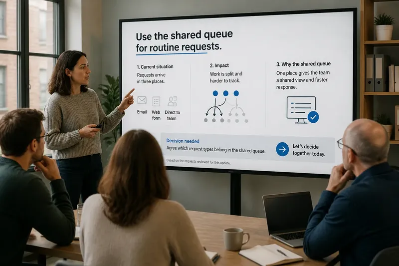
Make the connection to the takeaway visible. A reader should not have to infer why a chart, quotation or image is present. Use a short label that names its purpose, such as “Requests now arrive in three places” or “One queue gives the team a shared view”. The label should interpret the material without overstating what it can support.
Say you are preparing a one-page presentation for a team meeting about duplicate requests arriving by email and a form. Your takeaway is, “Use the shared queue for routine requests.” You could open with the two current routes, show a small diagram of how they split the work, and close by asking the team to agree which request types belong in the queue. Each element advances the same decision; a decorative picture of an inbox would add little unless it clarified the process.
When evidence is uncertain or incomplete, show that plainly. A small note such as “Based on the requests reviewed for this update” helps a reader understand the scope. Do not turn a limited observation into a sweeping claim just to make the page feel decisive.
Arrange the page
Give the takeaway the clearest position and strongest visual weight. Supporting points can sit beneath it or follow a simple left-to-right path, depending on the relationship between them. Think of the page like a well-set table: the main dish should be easy to see, while the side dishes support it rather than compete for attention.
Use alignment, spacing and contrast to show which items belong together. A thin rule or a restrained colour difference may separate evidence from action. More boxes, arrows and accent colours do not automatically make a message clearer; each visual device should explain a relationship the audience needs to see.
Choose a chart only when it makes a comparison easier to grasp than words would. A line chart can show direction over time; a simple bar chart can compare categories. If the values are not central to the decision, a concise label may serve better than a miniature chart whose axes and marks need explaining.
Keep type large enough for the way the page will be shown. If the slide is likely to appear in a small meeting window or be printed, check that labels remain readable at that size. Remove decoration before shrinking essential text to make room.
What belongs on the final slide?
Should the takeaway appear twice?
Yes, if the second appearance gives it a different job. State it near the start so the audience knows how to read the supporting points, then return to it at the end as the decision or next action.
How much evidence should fit?
Use only the evidence needed to make the takeaway credible for this occasion. If a detail changes the decision, include it; if it only adds background, leave it for a follow-up conversation or supporting material.
Should the slide include speaker notes?
Notes help the presenter remember context without loading the page with extra prose. They do not travel with every export or presentation setup, so keep any detail the audience must understand on the page itself.
Close with a decision
The final area should tell the audience what happens next. Depending on the occasion, that may be a clear request, a named owner, an open question or a date for revisiting the choice. Avoid ending with a vague “Questions?” if you need a specific response from the room.
Before presenting, inspect the page in the format people will actually see. Check the takeaway first, then follow each supporting point in order and ask whether its purpose is clear. Finally, look at the last line: it should make the expected response unmistakable without adding a second, competing message.
A one-page presentation is not a compressed report. Its value comes from helping an audience see how a particular occasion leads to one useful thought or decision. Keep the supporting material in service of that thread, and the page can remain clear even when the conversation around it is brief.